News?
This is as close as I'm gonna come to a blog, y'all.
...and don’t be shy about clicking that “fullscreen” box if you see one.
1/10/13
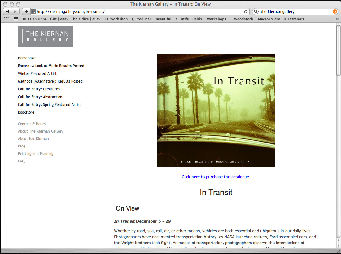
Did I mention that I had a piece at the Kiernan Gallery in Lexington, VA for their show ”In Transit”? It was a busy month. I kinda forgot to promote that one… Oh well.
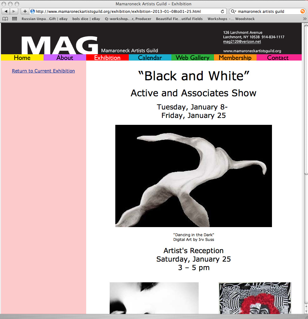
I guess if you are local to Westchester County, you could always see another silver gel print that I have hanging at the Mamaroneck Artists Guild. I was accepted as a guild member in full last October, so I hope this will be one of several shows I am a part of there this year.
This print is of the boardwalk in Asbury Park on a misty morning, with the skeleton of the old Casino barely visible in the distance, like a faded memory. I had printed it for a couple of close friends, Dave and Moo, and it came out so nice that I submitted my personal copy, which if I’m honest, I almost don’t want to sell because I think it came out very nice… It’s kinda high key and all articulated grain, so the nature of the image changes as you get closer to it… almost in a stippled pointillist kinda way. Anyhoo it is in the ”Black and White” show at The Mamaroneck Artist’s Guild, Opening Reception is this Saturday, January 12th {don’t mind their typo} from 3 – 5 pm.
126 Larchmont Ave, Larchmont NY.
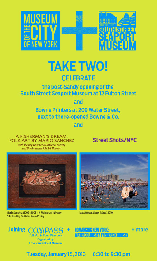
If you are more of a Downtown kinda person, then you could always swing by ”Street Shots / NYC” at the South Street Seaport Museum. It is a show in cooperation with The Museum of the City of New York and features one of my New York street images.
“Images by nearly 100 photographers, selected from over 5,000 images submitted to a juried open call, that reflect the spirit and diversity of street life in the city’s five boroughs as well as the evolving styles and formats of contemporary street photography.”
http://www.southstreetseaportmuseum.org/Articles.asp?ID=259
There is an opening reception on Tuesday (Tuesday?) January 15 from 6:30 to 9:30.
12 Fulton St. NYC.
And finally… whew If you always were interested to know what the school at The International Center of Photography was like why not spin by on Friday the 18th after work. There will be an opening reception for the ICP staff show. It would seem my New York school abstract series is on tour again, this time 4 of my 30”x30” canvas photographs are on display. So if you’re midtown I can get you a glass of wine (your of age, right?), show you around the darkrooms I work at and in, and we can see some quality artwork of my fellow ICP staffers. Hey there are worse ways to spend a Friday night.
Friday the 18th at the ICP school (the glass cube) at the corner of 43rd & 6th – a block from Times Square.
OK. ENOUGH SHOW NEWS!
12/12/12
A Little Revelation
You know, when it comes to photography there is no gospel. I don’t mean to say that there aren’t serious canonical works: Adams’ “Camera”, “Negative” and “Print”, “The Darkroom Cookbook”, and everyone’s primer, Hornstein’s basic “Black & White Photography” being among them. When it comes to standard practice, though, you’ll find about as many workflows as photographers. There are about a million ways to skin a donkey and woe is to the shooter who is so invested that they see their way as the only way to do a thing. Close-mindedness is exactly the place where learning ceases.
That having been said there are a few approaches to printing. Establish a contrast grade, find the density range, modify time and contrast to get the info you want to pack into the print. There are many who will tell you to address your highlights first, then work into your shadows. The philosophy being that higher contrast will steal from your highlights in a way that no amount of extra time will compensate for. Increased contrast filtration simply blocks that info. So get the highlight tonal relationships you want and then sink your blacks… Extra time, split filter with a pop of high contrast filtration, hotter developer, more agitation in the soup, dual bath developers, water baths, flashing paper… There are as many techniques to introduce density as the day is long. I could loose a few fingers and still be able to count on one hand the number of printers I have met who are a master of all of them. But most of these people will tell you to work down from the highlight.
I am a wholistic printer. Well I am a wholistic photographer in general. I use roll film, so I keep to certain standards, but generally I choose materials that will dance with each other. Emotion sets the tune. Ideally you walk back from the subject. How does what I’m shooting make me feel? Should it be abrasive or soft and dreamy? Is it nostalgic, or is it frenetic? It’s all about the optic-film-development connection for me. I’m a big proponent of mixing those ingredients to come to a unified flavor, and have that echo and compliment what emotion the image wants to put forth. Often it’s easier said than done and requires almost psychic ability to know what you’ll need loaded, but there’s the trick, right?
So in printing the way I’ll address a print is informed by what the image is… What it says to me. What is the important bit of the image? Where is the critical info? How should the image feel? Yes if it’s a high key or light and airy image I’ll spend my time tickling the tonal high-grounds. Trying to get it feathery and delicate, but way more I’m down in the blacks… Trying to eak out information as it just emerges from the obscurity of shadow. I console myself that this is just an approach that matches the image… I’m just being true to it. My other mind constantly reminding me that Ansel would say I’m being a technical idiot.
I have been accused of printing excessively dark. It’s true. I do. I no longer trust my eye to see the drydown, and now will take a hairdryer to a test print just to make sure how much darker it will go once it is no longer wet. I have become a huge fan of potassium ferricynide; almost all of my prints are spot bleached to some extent. I have found coping mechanisms. I still print dark though.
Now I see a philosophy to it. That’s the wonderful thing about photography. If you look with the right kind of eyes you can find something in yourself that is behind what you have always done instinctively. It’s revelatory. I seem to remember reading at some point that unlike most painters who start with lighter tones, Da Vinci would start by painting a black wash to his canvasses. His theory was that in nature all things exist in darkness, and it’s only by exposure to light that we can know them.
I spend so much time in the shadows because my images live there. I reveal bit of myself; I want to be seen. I shine a light and put just a little clarity on the page, but like the people I photograph on the street, or anyone anywhere for that matter, I only reveal so much as I’m willing to be known.
9/7/12
Ever been to B’awmer? It is a photographers playground. Bring backup though. That town turns on the drop of a dime. I’ve a few more that I shot that I’ll put up here and clean up the edit, but I’m too damn tired to scan any more today. Here’s what I’ve got thusfar.
5/7/12
OK. I could be accused, and fairly accurately, that I have been neglecting my pseudoblog and website. Guilty.
I have been pursuing other endeavours that though photographic were not completely in line with developing my work. In short I’ve been productively procrastinating. Thankfully I’ve realized the error of my ways and have gotten back on track with my own work.
Whew.
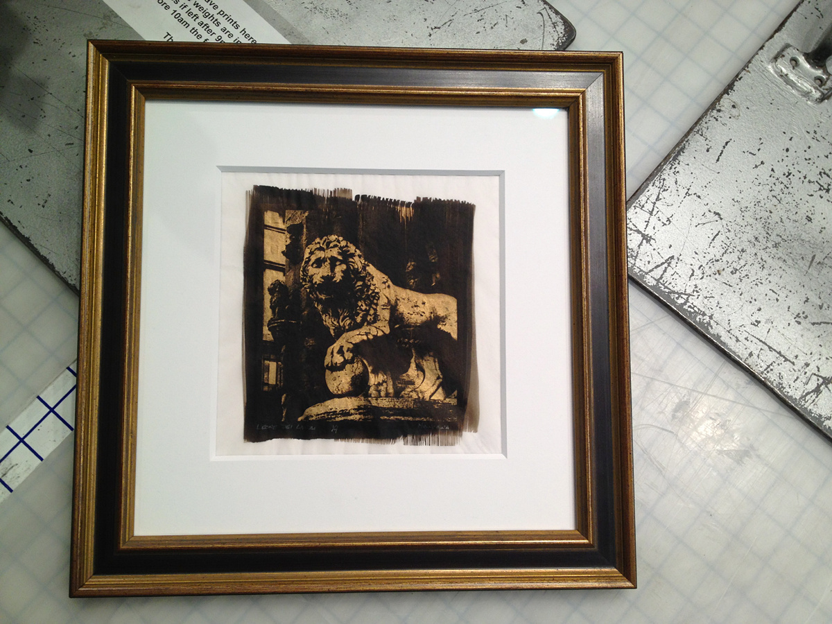
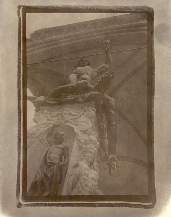
So lately I have kind of fallen in love with alternative processes. Not that I kid myself that in this world silver printing is anything other than “alternate”. But I have to say there is more than one kind of salts, and lately I’ve been hooked on the even older and rarer stuff: Platinum/Palladium. Don’t get me wrong, I’m digging on the Van Dyke Brown too, but I really think that P/P is a deep process that is going to have my attention for quite a while. I will always love and print silver, but these kinds of hand painted emulsions are giving me more of a say in the surface and substrate of a photograph that was previously largely dictated to me. So it’s really exciting for me.
I’ve particularly been into this process that I first saw of (his name will go here when i remember it) and Dan Burkeholder while studying with Tricia Rosenkilde (who is a fantastic teacher who I am quite indebted to). It is a process of Platinum printing on vellum that is then gold leafed. Well I was floored with these prints. They addressed some kind of aesthetic that I had been searching for for some time. Anyway here are some results.
SHOW ANNOUNCEMENTS:
MAMARONECK ARTISTS GUILD
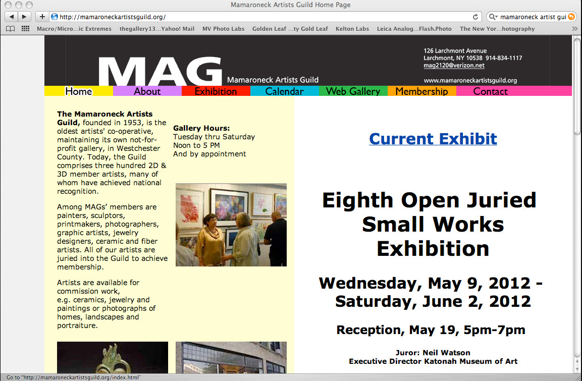
One of these pieces was accepted into the Mamaroneck Artists Guild “Small Works” show. The reception is on May 19 and anyone who wants to come would be so very welcome by yours truly. Libations on me.
DARKROOM GALLERY
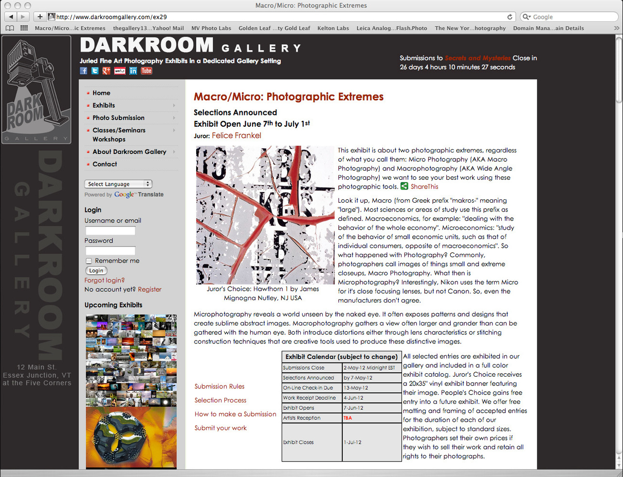
Three of my pieces were accepted into the Darkroom Gallery’s “Macro/Micro: Photographic Extremes” show. One of which was snagged the Juror’s Choice award. This photo has gotten me some good play. I’m super excited to be in this show (both of them really) and have both the macro and micro represented. Happy days!
10/13/11
Bruce Davidson is, in fact, very savvy
When I was a kid I wasn’t wild about riding the subway in NYC… I always though I’d catch something.
years (and more years) later my liberal mind told me that it couldn’t have been like that, that I was just too sensitive a kid…
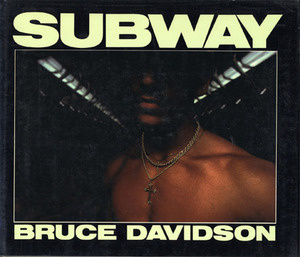
Just got home from Bruce Davidson’s opening for the third edition of his classic “Subway” book. It was the first time I had seen actual prints outside of the original book. Amazing. But like full on, nose six inches from emulsion for long long minutes on a single print impressive. These kinds of images – and I’m talking low light, slow speed chrome (slide film) – have a kind of aesthetic all their own… kinda like Mary Ellen Mark’s Falkland Road. There’s just nothing that touches that look. It is pure unto itself. Honest.
I remember seeing the book for the first time. I think it had to be from my buddy Dan Elliott’s collection. It had to be… all my formative photo learnings came from him. I can recall those images in my mind. If you’ve not seen this body of work I suggest you seek it out. It is well worth the look.
It’s a microcosm of a NYC before it became sandblasted and sanitized by Giuliani and the army of real estate developers. These photos were taken during a time that graf artists today hold as the holy daze, during the birth of Hip Hop, when the entire city was a canvass and there were no galleries or magazines to tell us that graffiti was something other than crime… and maybe that’s why the subway, the underground, was so emblematic of NYC in the early 80s. In these photos you’ll see crime as well as love, in action, and the effects, the before and after and all the living that goes in between back when the city was still feral.
One of the things that struck me about the show was how the prints somehow didn’t square with my memory. And it wasn’t just the book repro quality. Amid all the iconic elements that put in solidly in time, from old Ford LTDs to the original look of the Guardian Angles, there was a freshness to these images, they somehow seemed cleaner, less dingy, less the look of piss and sodium vapor light. Then I saw in the middle of the room a case that showed each of the three editions and samples of the images contained (always check the cases in photo shows). In fact the modern images were much more color neutral. It looked as if somewhere between the 70s and the 80s Bruce had found this mysterious little button he had never before seen on the back of his camera, a tiny label underneath it reading “White Balance”.
So I’m at the bookstore at ICP to kill some time before I meet up with Liesa at Javits for ComiCon, and I’m moaning to my friend, Sarah about how I had missed Bruce signing at The Strand a couple of weeks back, and she tells me about this opening. Here’s a trick, if you’re tragically out of the know, have friends who’re in it.
Anyway, we’re talking about books and how they are the real modern medium for photography, and working in the bookstore she really gets it and is up on all sorts of shooters I’ve never heard of. Well during conversation I get around to this signed book in the ICP library, one of Bruce’s, that people casually leaf through… a signed first edition that I and apparently almost no one else seems to realize is firmly worth about $1200. “Well he was really savvy. His books, especially his first editions, were never huge print runs and he rarely pumped out multiple editions.” Which leads me back to the quandary I had as to why he had made another edition of this somewhat rare classic (signed copies of the first edition going for anywhere from $200 – $500). Why add more water to the dilution?
Jump back to the Aperture Foundation, me in front of the case showing the three editions. Here’s where I get it. Bruce Davidson is, in fact, very savvy. Rather than having made three editions of the same book, he has made three expressions of the same body of work. It is really a fantastic exercise for any artist who loves color, to look at these three books and see how the interpretation of printing and the palate used has a direct influence on how the same images are perceived. It very much the kind of thing a printer would do. He is giving us an education, if we’d only just pay attention.
I go to the counter to buy a book. Turns out he’s not signing tonight but rather on the 26th. They do have signed editions to buy though. If I wasn’t going to be out of town I’d come back to the signing, but as it is I just buy the book. “Well, if you’d have come back and had it signed by him, you would have had it personalized and that would reduce the value of a signed edition” I try to console myself with. “But I’m not going to be selling these things, to me it’d be more valuable to have it personalized.” was the reality of it. No matter, it’s my first signed Bruce Davidson book and I’m plenty happy with that. “Besides this won’t be the last time.” I think taking one last look around the room and spy the three lustworthy editions in the case. “nope, not even close to the last time… Savvy Bastard.” As the door to the elevator closes, my wallet lighter, I think to myself… I gotta spend more of my collecting habit on $1 Laserdiscs.
Check it out:
http://www.aperture.org/gallery/
Artist Talk and Book Signing:
Wednesday, October 26, 6:30 pm
Aperture Gallery and Bookstore
547 West 27th Street, 4th Floor
Between 10th and 11th Avenues
New York, New York
(212) 505-5555
10/10/11
So I’m very excited to be taking yet another class with master printer Brian Young. If you’ve looked at some of Eugene Richards books odds are you’ve seen his printing… he did such classics as Dorchester Days (Reprint), Cocaine True Cocaine Blue, Americans We… He printed Nachtwey’s Inferno, and one of my favorites, Merry Alpern’s Dirty Windows among many others. Epic stuff. It’s an honor to learn from him. In a couple of months I should have all new work at The Gallery 13. I’m not saying it will look like it was printed by him… just wanted to give him a shout out on my site, and, you know… let you know where I’m comin’ from. ;)
http://www.phototechnica.net/
9/1/2011
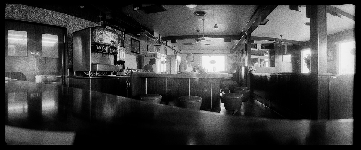
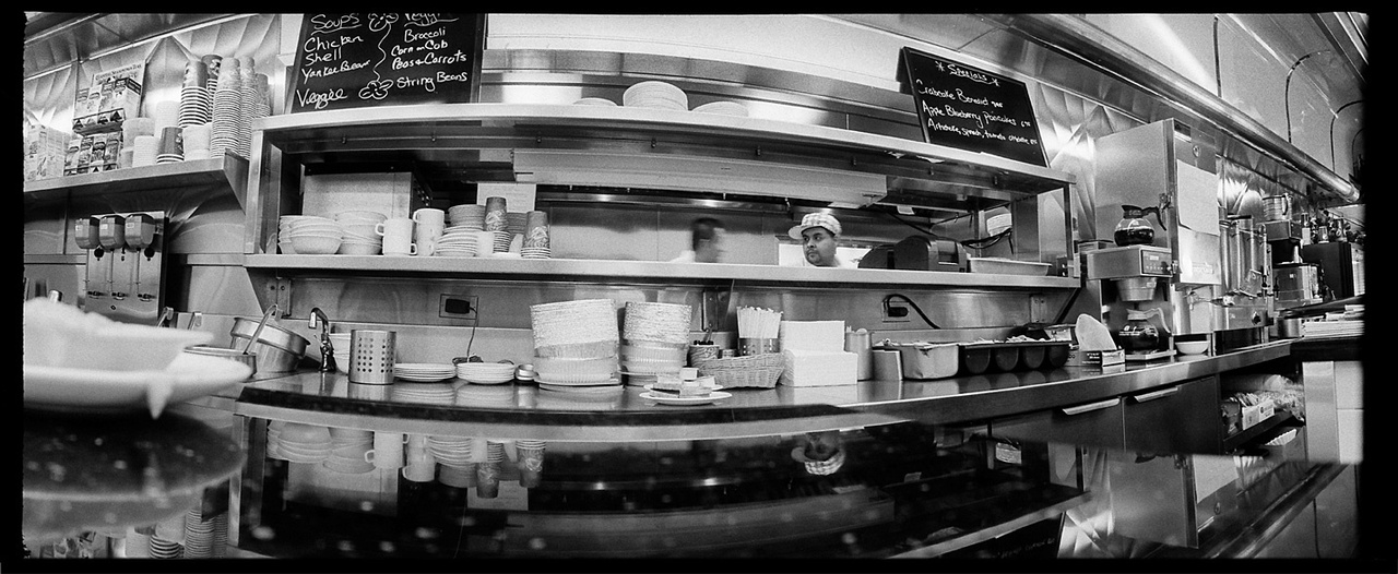
I was going to go into differences in aesthetics of the ole Rodinal/tmax 3200 and the D-76/tri-x bit, how they match to optics (as seen in the last 2 panoramic sets on this page), and how that relates to specificity in art today, but instead I should mention that we had a hurricane.
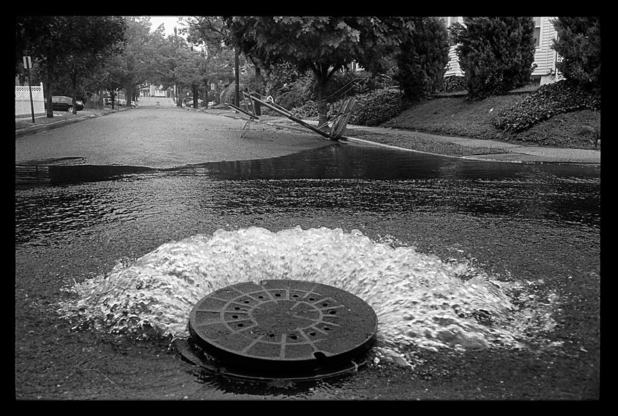
I’m sure you heard about Irene. I’m sure if you live on the east coast then you probably have a few gallons of untouched water somewhere in your place. Strange storm… lot’s of hype and some of it lived up to the hub-bub but then it was in tight little pockets where other places were left unscathed. I guess that’s what floodwaters will do.
So I have this tiny stream that runs through the park behind my house. They actually call it “The Third River”. You can look it up. Usually that’s a source of jokes about the mighty Yantacaw (it’s other name) as it’s ordinarily a trickle… except when it floods which isn’t infrequent. Then it looks like… well a river… with a town in it. So here are some images after Irene came to town.
5/20/2011
What a night last night! The turnout was almost too good. With everyone spilling out into the street, it was honestly difficult to get into the gallery and jocky for a spot to see the work. I’d recommend that if folks find themselves in the LES they might want to pop into Umbrella Arts… you might actually see the photos this time. It was great though, as was having Japanese with my Jodi, Bieul and the Minister and then taking in Cave In who i must say put on a fine fine show… though the room sounded a tad muddy. I guess that’s what I get for being old and leaning against the back of the room. Anyway, thanks again to all of my amazing friends for swinging out, and I’m sorry if I missed anyone.
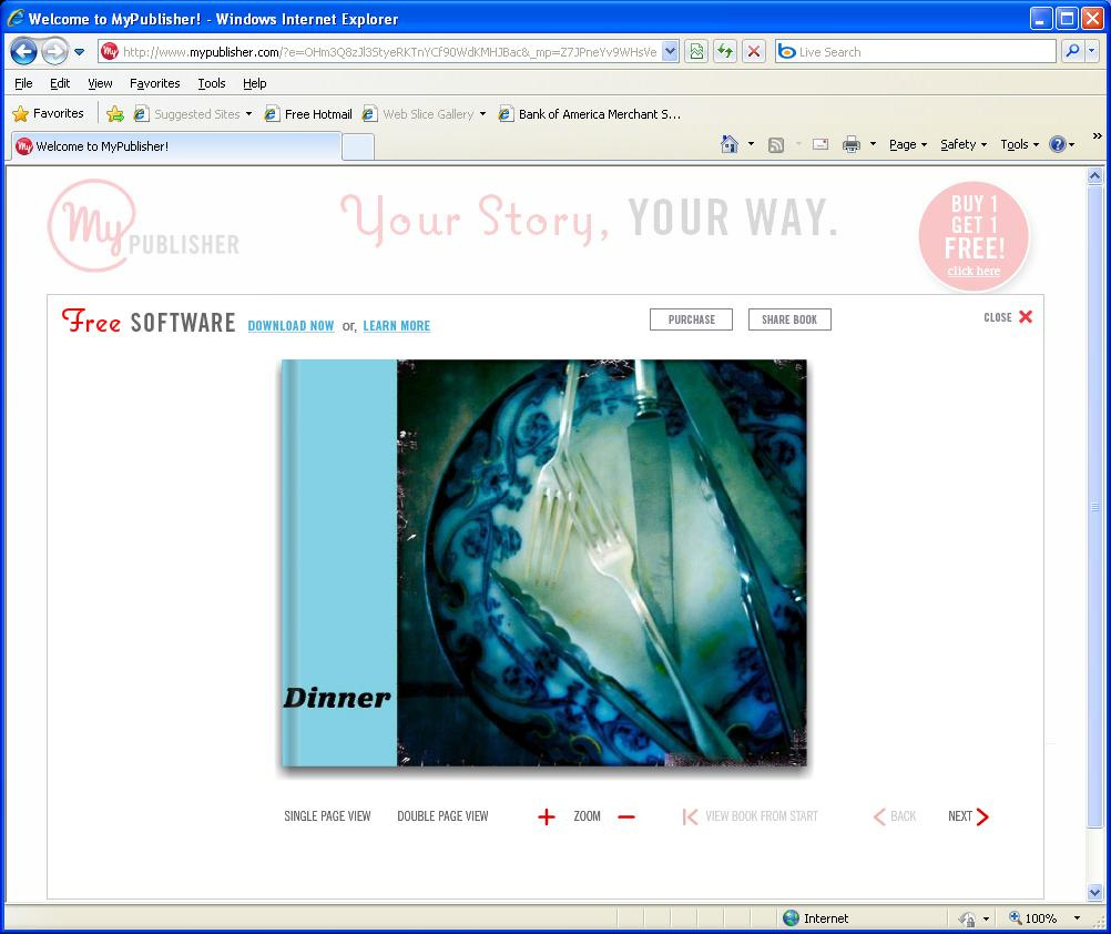
Oh yeah… Umbrella Arts has published a book of the show “Dinner”, and not only is my work in it, but I’m honored that they chose my image to grace the back cover! If anyone is interested in buying some of this fine and varied work it can be purchased at the following link:
http://www.mypublisher.com/?e=OHm3Q8zJl3StyeRKTnYCf90WdKMHJBac&_mp=Z7JPneYv9WHsVeJBleA+vkykBi3l8ZoD
Good Things All!
5/18/2011
I just thought I had to say something about my friend Anton Orlov and his excellent lab, The Rollov Film Center. It is at 2709 1/2 Adams Ave. in San Diego, CA. If you are a long time pro, or a first timer who’s curious about a wet process there is something for everyone interested in proper traditional B&W photography. Check it out!
www.darkroomprinting.com
PS: come to my show tomorrow!!!
5/13/2011
First of all I wanted to thank all of my friends, old and new, for coming out to my show at BOND and making it such a huge success! It’s still up until the 25th, so if anyone is still interested in catching it, I’d love for folks to swing by.
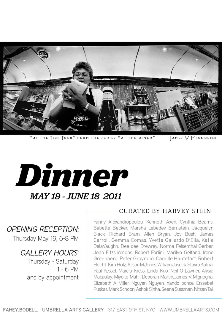
Also dropped off my print for the Umbrella Arts show “Dinner” yesterday before going to Brooklyn to hang with some friends at a Dr. Who themed bar. (yes, there was a Tardis and yes, it was bigger on the inside than on the outside.)
Very excited to be a part of this show, and saw some of the other work to be hung… I’ll be in some very very good company. It opens on Thursday, May 19th (yep, this Thursday) at 6pm. Hope to see all my peoples there!
4/21/2011
Plenty Good News Today.
Today I met with the good people at BOND in TriBeCa, and they have decided to take me on as their solo artist for May! I will be having an opening for “Tokens & Fragments” on Wednesday, May 4th at BOND which is at 25 Hudson St. between Duane and Reede streets. Super excited for this!
Also Found out that one of my photographs has been accepted into the “Dinner” show at Umbrella Arts! The opening for that show will be on May 19th, which I’m gonna say is a Thursday, but don’t hold me to that. I’m very honored to have been selected for this show, and can’t wait for the opening. It will be at Umbrella Arts, 9th st. between 1st & 2nd aves.
I’d love to have everyone come out for these. Be there!
4/7/2011
Material Matters
I’ll be honest with you, when I first tried Rodinal I was not a fan. I had a sneaking suspicion that part of it’s appeal among my friends was the fact that it was a liquid concentrate and that a little out of that bottle went a long way. Not those these are in any way bad things. Economy combined with not having to mix and possibly inhale powdered chemistry put the venerable developer squarely on the side of righteous chemistry. But they are not the reasons to choose a developer.
Now I know that to say that I use Kodak D76 seems like something of an admission, like having to say that you put sugar in your pasta sauce or enjoy the literary styling of Danielle Steel. Saying that I soup in D76 always made me feel a little Photo 101, so when I finally tried Rodinal I was prepared to join the club of those photographers in the know. The negs came out looking all right I thought as I held them still wet above me in one long strip. Then I was at the enlarger and when printed I saw grain that I could drive a truck through. This was not what I was used to, and I’d be damned if I was going to switch up my old Tri-x.
“I hate developing film.” I hear this a lot. The great film/digital debate notwithstanding, even stubborn old-fashioned dyed in the silver printers I know have said to me many times that they can’t stand the process. “There’s nothing to do. You follow the instructions and if you screw it up, you’re finished.” All of that may be true, but it misses the point. Ansel Adams once said something to the effect that if the print is the performance, then the negative is the score. I guess there will always be some who will hold to the idea that the art and moment of creation happens at the instant the shutter is dropped and that anything following that is little more than the kind of drudgery that would be better suited to the hands of some printer or lab technician. To me it’s always been like Christmas.
I mean I have a number of romantic notions about the whole of photography that I keep guarded for the fear of someone taking my sentimentality for the sap that it is, but that makes it no less true. I’m not sharing my love letters with you. Honestly though, I can’t fully wrap my mind around why it’s the arduous task to so many shooters (now making contact sheets… there’s a nutbuster for you). If you’re still in film, than you’d think that more people would love and respect the negative, and that’s just what this process is. Just because the stuff is in a tank and you can’t see it doesn’t mean that you’re not crafting something. Care should be invested.
So I was left to my old Tri-X and the D76. I was getting my acutance from the good lenses I’ve acquired, so I didn’t need to compensate with a more active developer. More accurately there was a look I was going for… somewhere placed in time. It was an aesthetic that could bridge 1932 to 1982, and the modern rendition of Tri-X was the grain to carry it, but while the rodinal sharpened the edges making for a more abrasive look, D76 had the kind of replating action that softened it. I’m not sure it lent to any greater tonal scale, but it put the dream coating on the grain that when enlarged and printed even at a high contrast kept the velvet in the felt.
Then along came this project that I wanted to do. It is by it’s nature a low light gig, and short of pre-exposing my trix I decided to shoot with T-Max 3200. It’s a film I was familiar with and had always had good luck with. So here but for the grace of grain went I. I did the standard poll of those who know better, what their preferred combos for T-Max 3200 were. “You ask 5 photographers what they like, and you’ll get about 8 opinions.” said my friend at B&H, and he wasn’t wrong. The gurus had steered me to HC110, XTol and Rodinal (which I should mention is an Agfa product and has been repackaged as “Adinol” by the company Adox, which itself is repackaged Agfa) Some would even have me shoot the Ilford product in T-Max’s stead, but I have a bit of a soft spot for the high speed Kodak stuff, ever since I first shot the venerable EPH (Ektachrome 1600) a film who’s time has sadly past and will never be replaced. May she rest in peace.
My main guru led me down the path to HC110, and sweetened the pot by telling me that this is the combo that he uses on Antonin Kratochvil stuff (though he would only later reveal that he uses a stock that is seasoned). My respect for him, and love of Antonin’s work had me with the HC110. After finding a dilution that seemed to work, and this is not always an easy feat, 125ml to 4000ml gave me a good even tone and reliable results, but there was something that I still seemed to be missing. Now if you’ve ever shot this stuff you’ll know that it has asteroids in the emulsion… it’s then kind of grain that if you got close enough to you might see Han Solo zipping about. It’s a real stellar trip in microcosm, but somewhere amongst all that I just didn’t seem to have that snap, that articulation and visual grip I was looking for. “Respect the grain,” I told myself. “If you want to honor those pebbles, run ‘me through Rodinal.” Next week I did, and it was spot on.
So I found a use for Rodinal after all. It’s also worthy, frankly essential, to mention that the main camera of this project is my Widelux that has a rotating 26mm, and is generally a softer lens than the Leitz Summicrons that are my main glass. It’s also a fixed focus lens, which means to get any kind of focus in it, I have to shoot at f11 and let the depth of field do the critical work. That being said I know to expect softness in the focus with this light and with this box, and somewhere along the line I’ve learned that the eye will accept softness if there is some articulated contrasty grain to catch onto. So at the time of this writing, I’m full of love for T-Max 3200 souped in Rodinal 1:50. It is the look for the job.
Last week I was underground in the labs at ICP running some 3200 I’d shot in Italy when I saw a guy not long out of his teens looking up and down from a sheet in his hands to the plastic pitchers in front of him with a certain amount of trepidation. After one or two questions answered, I followed with “It’s a bit like baking. Just follow the directions and you’ll be fine.” As I was mulling over the irony of how shitty of a baker I am, I wrote down my latest dilution specs on the bottle of Rodinal and put it back in my bag next to the HC110. Eventually I’d like to just be able to get any look from just two developers, one high energy and one low. My friend Jody never uses stop, rolls her agitation and mixes her own (guarded) developer from raw chemistry. It’s always nice to be reminded that there is so much more to know, and that if it’s increasingly fewer, there are still folks out there that can help you along. Understanding the importance of working backward from the image, and integrating your craftwork into the subject may be a profoundly rewarding thing, and it may illuminate all the creativity and art that is to be found all along that journey, but it’s still not gonna make my god damn contact sheets for me.

